UofT Course Graph
Posted on
This month, I decided to work on a project that I started a while ago. That is, graphing the entire UofT course network. That is, every course at University of Toronto are all connected together by their requisite requirements. Why did I decide to do this? Well, for fun. Also, I was curious on what the whole structure would look like in end. 🙂
First things first! I need to get the source for my data. That is simple in itself for me to find. I just needed to go the course finder website for each campus, and check how my browser is sending the xmlhttprequest (XHR).
The St. George campus made it simple, since the browser would send a GET request to their backend server at a particular endpoint, and the response would be a JSON, which is easy to process. The Mississauga campus made it cumbersome, since their backend response is an html format, which would be added to the existing webpage in the browser. This would require me to be do more work in parsing for the info. As for the Scarborough campus, the request being sent is a POST request, and the response I get back is JSON, but it doesn’t have the complete information about the course itself, and so I would need to send a request to another UTSC’s site to get the complete course information, and parse through it in order to extract it.
I used Python and the BeautifulSoup library to mine the sites for their data. I then saved them using the Pickle library, and then process them to generate to csv files: nodes.csv, and edges.csv. One would be filled with information about the courses themselves, which are nodes, and the other would contain information about how each course is connected.
The neat thing about these files is that they are formatted in a way that Gephi would understand. Gephi is a software that allows us to visualize network graphs. It has a lot of features, and you can customize the graph to your liking. I decided to colour-code each node based on their subject, and have the nodes vary in size based on the number of outgoing edges.
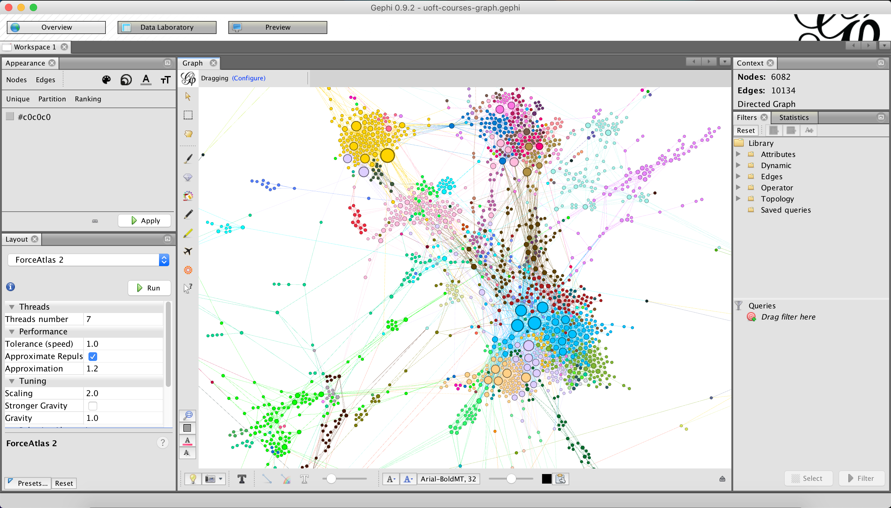
The advantage of Gephi is that it can provide us with all sorts of reports based on the graph’s topology. But now, the issue is, how do I show this to other users more easily? The easiest way to share something is of course on the web. So I needed a way to export the graph from Gephi to a static website, so I can deploy it on a host like Heroku.
I found that there was a plugin in Gephi that allows me to export it to a static site that uses Sigmajs to help visualize the graph. The final result was this neat graph that you can view on the web. At the time of this writing, you can only navigate through this graph if you are on your computer, so no mobile web support right now. It does have a search functionality, so you can find a node along with its corresponding neighbours in the graph.
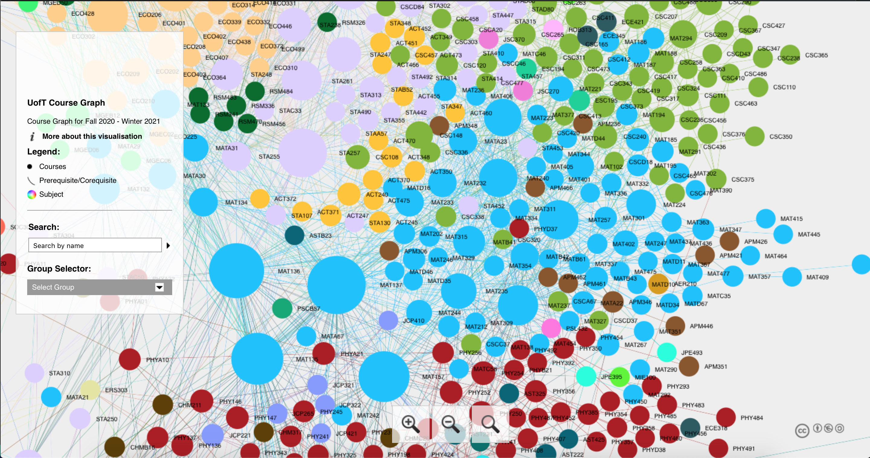
The graph isn’t perfect. For example, the graph is not showing any arrows, and the visibility of the labels themselves can be improved. I do plan to use some other graphing framework to make a cleaner looking graph, and figure out ways for the users to explore more about the graph’s topology. As of right now, I do feel intrigued by how the whole network turned out. 🙂
Here’s the link to the course graph: https://uoft-course-graph.herokuapp.com
The source code for the data miner: https://github.com/Playjasb2/UofT-Course-Data-Miner
The source code for the course graph website: https://github.com/Playjasb2/UofT-Course-Graph